library(dplyr) # Data manipulation & magrittr pipe
library(ggplot2) # General plotting
library(NMF) # aheatmap()
library(gplots) # heatmap.2()
library(RColorBrewer) # Brewer palettes
set.seed(123)
############################
# 2D histograms #
############################
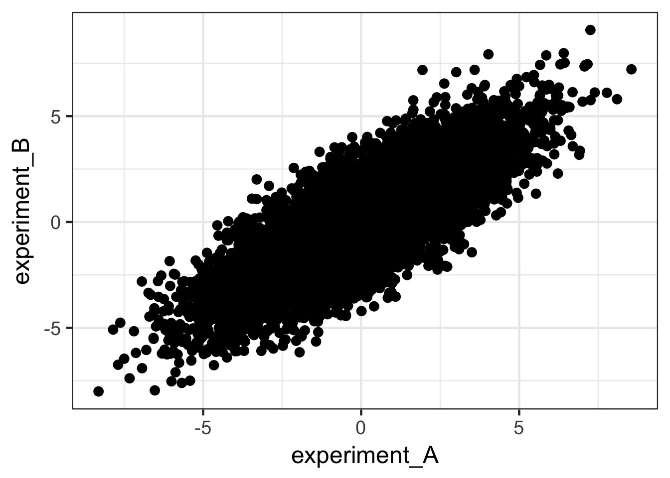
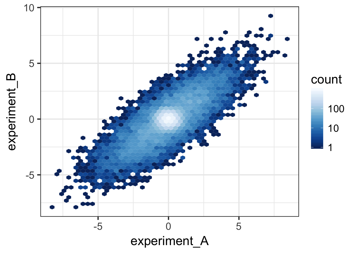
# simulate data that consiststs of paired observations in two experiments
covar_mat <- matrix(c(5, 4, 4, 5), ncol = 2) # Covariance matrix
data <- MASS::mvrnorm(n = 10000, mu = c(0, 0), Sigma = covar_mat) %>% #Simulate correlated data
rbind(matrix(rnorm(20000, sd = 0.4), ncol = 2)) %>% # Mix with uncorrelated data
data.frame()
colnames(data) <- c("experiment_A", "experiment_B")
# head(data)
# dim(data)
# Plot data with solid points
ggplot(data, aes(x = experiment_A, y = experiment_B)) +
geom_point(size = 3) + theme_bw(base_size = 18)
# Plot data as 2D histogram
ggplot(data, aes(x = experiment_A, y = experiment_B)) +
  stat_binhex(bins = 50) + theme_bw(base_size = 18)
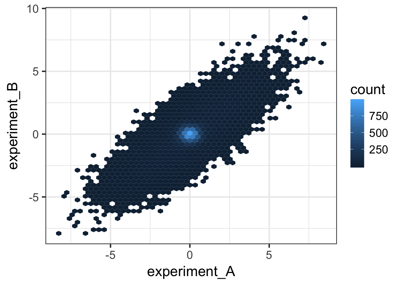
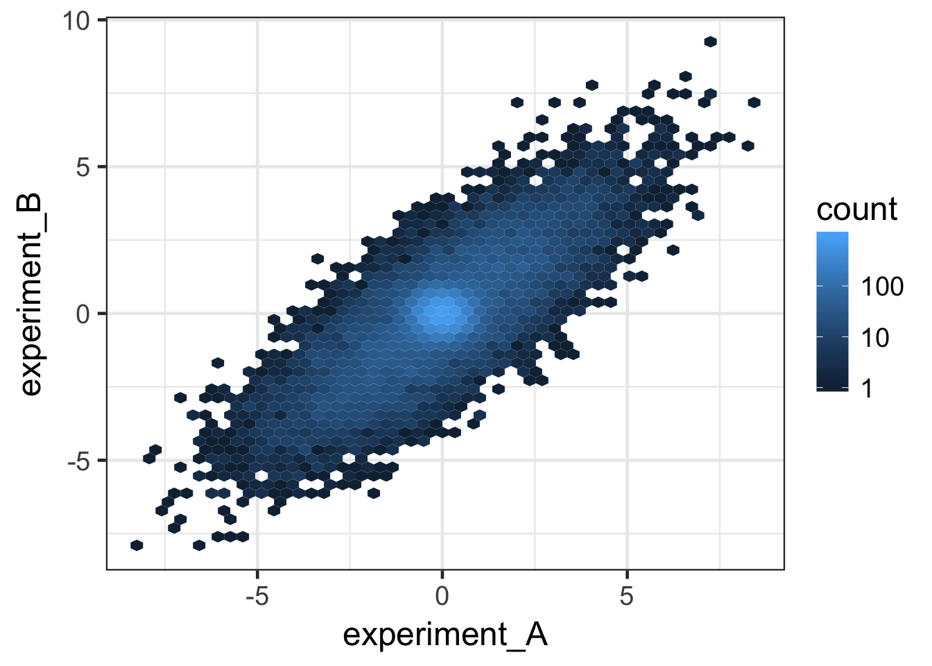
# Now make the color scale logarithmic
ggplot(data, aes(x = experiment_A, y = experiment_B)) +
  stat_binhex(bins = 50) +
  scale_fill_gradient(trans = "log", breaks = c(1, 10, 100, 1000)) +
  theme_bw(base_size = 18)
# Use Brewer palettes in place of default palette
pal <- brewer.pal(name = "Blues", n = 9) %>% rev()
ggplot(data, aes(x = experiment_A, y = experiment_B)) +
  stat_binhex(bins = 50) +
  scale_fill_gradientn(colours = pal, trans = "log", breaks = c(1, 10, 100, 1000)) +
  theme_bw(base_size = 18)
# use a multi-hue sequential palette (my preference for logarithmic scales)
pal <- brewer.pal(name = "YlGnBu", n = 9) %>% rev()
ggplot(data, aes(x = experiment_A, y = experiment_B)) +
  stat_binhex(bins = 50) +
  scale_fill_gradientn(colours = pal, trans = "log", breaks = c(1, 10, 100, 1000)) +
  theme_bw(base_size = 18)

##################################
# Tiled heatmaps #
##################################
# ==========================================
# using gplots::heatmap.2()
#
# This is a good option, but perhaps
# not the best (depending on your needs).
# ==========================================
# We're going to use Fisher's iris data set for the rest of the demo
iris2 <- iris # prep iris data for plotting
rownames(iris2) <- make.names(iris2$Species, unique = T)
iris2 <- iris2 %>% select(-Species) %>% as.matrix()
# Visualize raw iris data using "Blues" Brewer palette
pal <- brewer.pal(name = "Blues", n = 9)
pal2 <- colorRampPalette(pal)(50)
# ! Error in plot.new() : figure margins too large !
# heatmap.2(iris2, col = pal2,
# srtCol = 0, keysize = 1, adjCol = c(0.5,1), trace = "none")
# Visualize with column-wise Z-scores
pal <- brewer.pal(name = "RdBu", n = 11) %>% rev()
pal2 <- colorRampPalette(pal)(50)
# heatmap.2(iris2, col = pal2, scale = "column",
# srtCol = 0, keysize = 1, adjCol = c(0.5,1), trace = "none",)
# ========================================
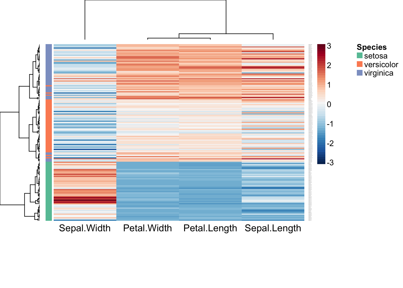
# using NMF::aheatmap()
#
# This is the "best in class" method.
# ========================================
# Plot Z-scores of columns and annotate rows
aheatmap(iris2, color = "-RdBu:50", scale = "col", breaks = 0,
annRow = iris["Species"], annColors = "Set2")

# Use Pearson correlation instead of Euclidean distance
aheatmap(iris2, color = "-RdBu:50", scale = "col", breaks = 0,
         annRow = iris["Species"], annColors = "Set2",
         distfun = "pearson")
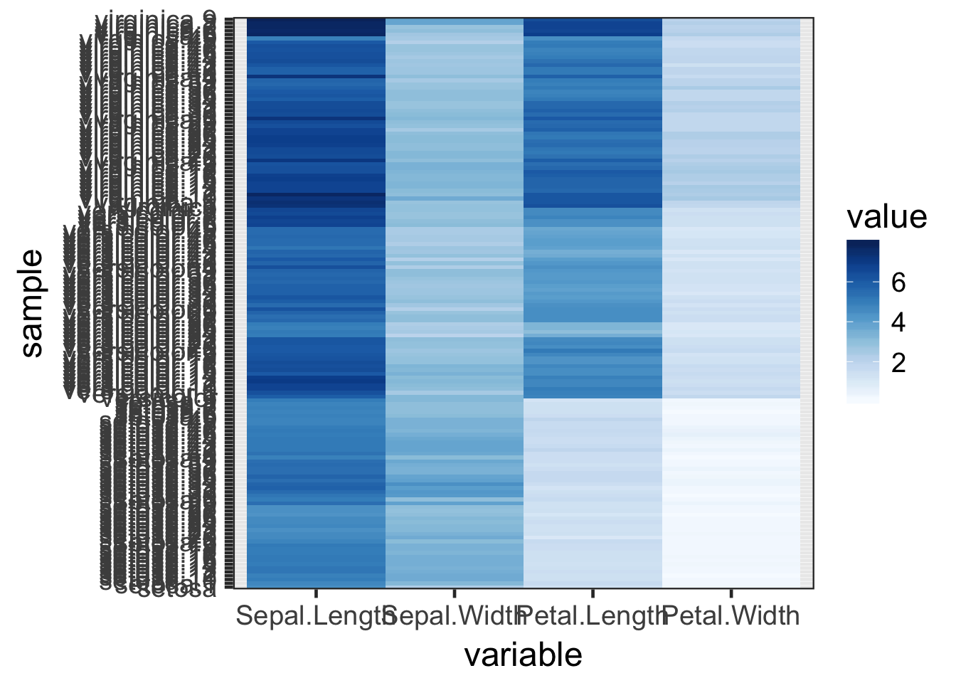
# ===============================================
#         using ggplot2::geom_tile()
#
#  This is the "hard way". I.e., not practical,
#  but may be helpful to the uninitiated for
#  understanding how the functions above determine
#  row / column order.
# ===============================================

library(reshape2) # long <=> wide formats

# cluster rows to deterime row order
row_order <- select(iris, -Species) %>%
  dist() %>%
  hclust() %>%
  `$`("order")

# melt iris data
iris_melt <- iris[row_order, ] %>%
  mutate(sample = make.names(Species, unique = T)) %>%
  melt()
## Using Species, sample as id variables
# plot raw data values
pal <- brewer.pal(name = "Blues", n = 9)
ggplot(iris_melt, aes(x = variable, y = sample, fill = value)) +
  geom_tile() +
  scale_fill_gradientn(colours = pal) +
  theme_bw(base_size = 18)
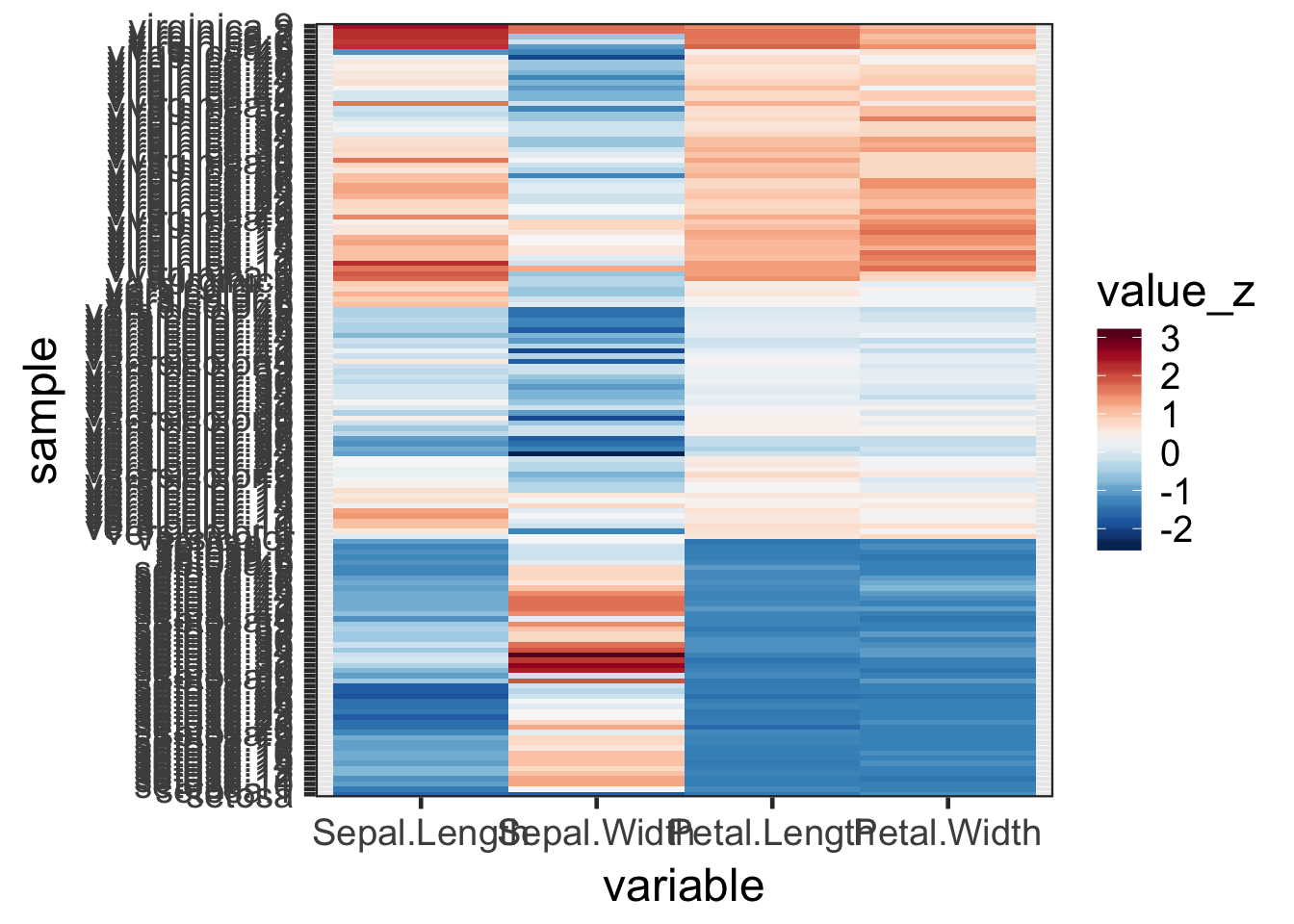
# Calculate variable-wise Z-scores
iris_melt_z <- iris_melt %>%
  group_by(variable) %>%
  mutate(value_z = as.vector(scale(value)))

# Color by Z-scores
pal <- brewer.pal(name = "RdBu", n = 11) %>% rev()
ggplot(iris_melt_z, aes(x = variable, y = sample, fill = value_z)) +
  geom_tile() +
  scale_fill_gradientn(colours = pal) +
  theme_bw(base_size = 18)